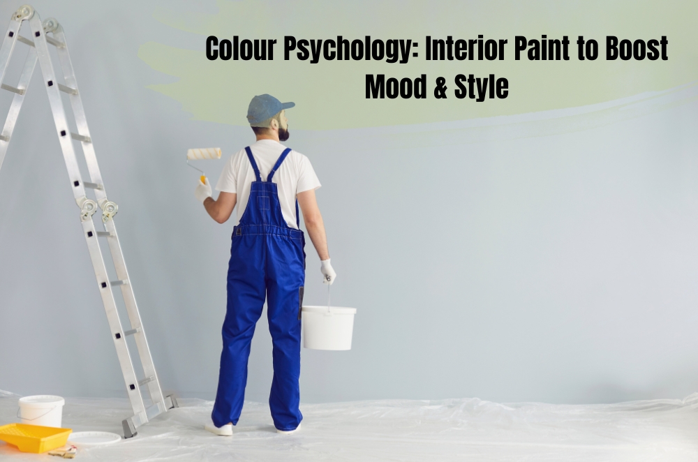
A couple of summers ago, we finally admitted that the walls in our old place looked sad. Scuffed, patchy, and this weird yellow that made everyone look tired. We booked Sydney interior painters, thinking, “Cool, fresh coat, job done.” But once the new colours went on, the whole house felt different. The lounge suddenly felt like somewhere you wanted to sit for ages. The bedroom stopped buzzing and finally felt sleepy. Same furniture. Same layout. Completely different mood.
That’s really what this is about. Not perfect Pinterest boards. Just understanding that the colours you choose are going to talk to you every single day. “Wind down.” “Wake up.” “Get moving.” Or, if you get it wrong, “Something here feels off, and I can’t put my finger on it.”
How colours actually feel when you live with them
Most people already know the basics without putting names to them. Warm colours – terracotta, peach, warm beige, clay – feel closer and more social. Cool colours – blues, blue-greens, smoky greys – feel calmer, a bit further away, more “breathe out”. Neutrals sit in the middle and change personality based on what’s around them.
- Living rooms lean on warm neutrals or greens, so people want to hang around.
- Bedrooms end up softer, with blue or green tones that don’t yell at your nervous system.
- Kitchens and dining spaces tolerate small hits of stronger colour because they’re busy rooms.
- Home offices and study nooks do better with clearer, cooler colours that don’t distract.
If you’re lining up interior home painting services, the most useful thing you can do is commit to big samples. Not three postage stamps. Proper swatches or sample pots slapped straight onto the wall. Look at them when you’re half-awake, grabbing coffee, when the afternoon sun is blasting in, and later at night with your normal lamps. The patch you keep trying to ignore is the wrong one.
Warming things up without making it loud
Warm colours earn their keep in houses that feel a bit echoey or “too modern”. They pull the walls in a touch and make big spaces feel like they’re meant for people, not just furniture.
- You’ve got a long open-plan area that always feels like a corridor.
- The living room is all tiles and glass and never quite feels cosy.
- Your place has that slightly sterile, display-home vibe you can’t shake.
- One clay or rust-toned feature wall at the dining end of the room so meals feel more intimate.
- Hallways are in a soft biscuit shade, so walking from the front door to the kitchen feels inviting.
- Warm walls paired with simple furniture, timber and natural fibres, instead of six other strong colours fighting for attention.
I’ve watched people go all-in on a strong colour because it looked amazing in a styled photo. On the four walls of a small bedroom? Totally different story. The usual fix is to keep the same hue but drop it to half-strength or quarter-strength. Same “feel”, easier to live with.
Cool colours for sleep, focus and breathing space
Cool tones are your reset button. Blues, blue-greens and some greys don’t ask for much attention, which makes them perfect for rooms where your brain needs to slow down or switch gears.
- A bedroom never feels restful, even when the bed’s made and the floor’s clear.
- You’re stealing a corner of the living room or spare room for a study nook.
- West-facing rooms get hammered by late afternoon sun and feel a bit angry by 5 pm.
If you’re repainting more than one room, think in families of colour instead of treating each space as a totally separate project. Grab a colour card and use:
- The lightest version in hallways or darker spots.
- A mid-tone in the study or guest room.
- The deeper version in the main bedroom for a cocoon feeling.
Just watch the overall mix. Cool wall colours, plus cool floor tiles, plus very white lighting can start to feel clinical. A bit of warm timber, woven rugs and warm-white globes bring it back to “calm and cosy” pretty quickly.
Neutrals, whites and going dark without regret
Neutrals sound easy until you’re standing in the aisle facing fifteen “different” whites. Every single one has an undertone – some lean warm and creamy, others cool and crisp, a few drift slightly pink or green. On the wall, that undertone is what you actually live with.
- Warm whites and greiges love older homes, period details and shadier rooms.
- Cool whites look good in bright, modern spaces with lots of glass and strong light.
- Mid-tone neutrals and stone shades are kinder if you have kids, pets, bikes inside and the usual chaos.
- Behind the TV so the screen doesn’t scream at you.
- Behind open shelves, so books and ceramics stand out instead of disappearing.
- Behind a bedhead to give a plain bedroom some weight and drama.
If you’re still stuck scrolling and second-guessing, it can help to line up what you’re pinning with a more detailed guide on home interior painting. Seeing the same colour in different houses – small terraces, big family homes, darker flats – makes it easier to trust your choice.
Choosing interior home painting services that don’t cut corners
In NSW, it’s worth checking you’re dealing with licensed painters in Sydney, not just “a mate with a roller”. The state government’s licence check lets you confirm a contractor or tradesperson is properly qualified before they start. It’s dull admin, but it’s also what helps if anything goes sideways.
- What prep is included – filling, sanding, gap sealing, undercoats?
- Which brands and finishes they’re planning to use in each room, and why those ones?
- How they’ll protect floors, furniture and joinery day to day.
- How many coats are actually allowed? “Paint included” doesn’t tell you much.
If you’re still half-tempted to DIY, it’s worth reading what professional interior painters say about how long things really take, where safety gear matters, and why stairwells and high ceilings have broken many weekend warriors.
Final thoughts
Colour psychology at home isn’t about following a strict chart. It’s more about paying attention to how different tones make you feel, then setting your rooms up to back that feeling every day. Warm shades when you want conversation and connection. Cool shades when you want rest or focus. Neutrals and broader accents pull everything into one story, so the house feels intentional rather than random. The honest part is looking at the way you live right now – the bags that land by the door, the laptop on the dining table, the dog hair, the Netflix nights – and picking colours that work with that life instead of pretending you live in a showroom. When you combine that self-awareness with careful work from Sydney Paintmasters’ professional interior painters in Sydney, you’re not just repainting. You’re quietly tuning each room so it helps you sleep, focus, chat, or just breathe a little easier every time you step inside.